Several years ago, I decided that I would explore the world of fabric dyeing. It was in fabric dyeing that I really learned about color and the difference between yellow-green and blue-green.
When mixing the colors to make the dye, suddenly the resulting colors make more sense, and now, after many yards of dyed fabric, I find it easier to choose the colors for a quilt.
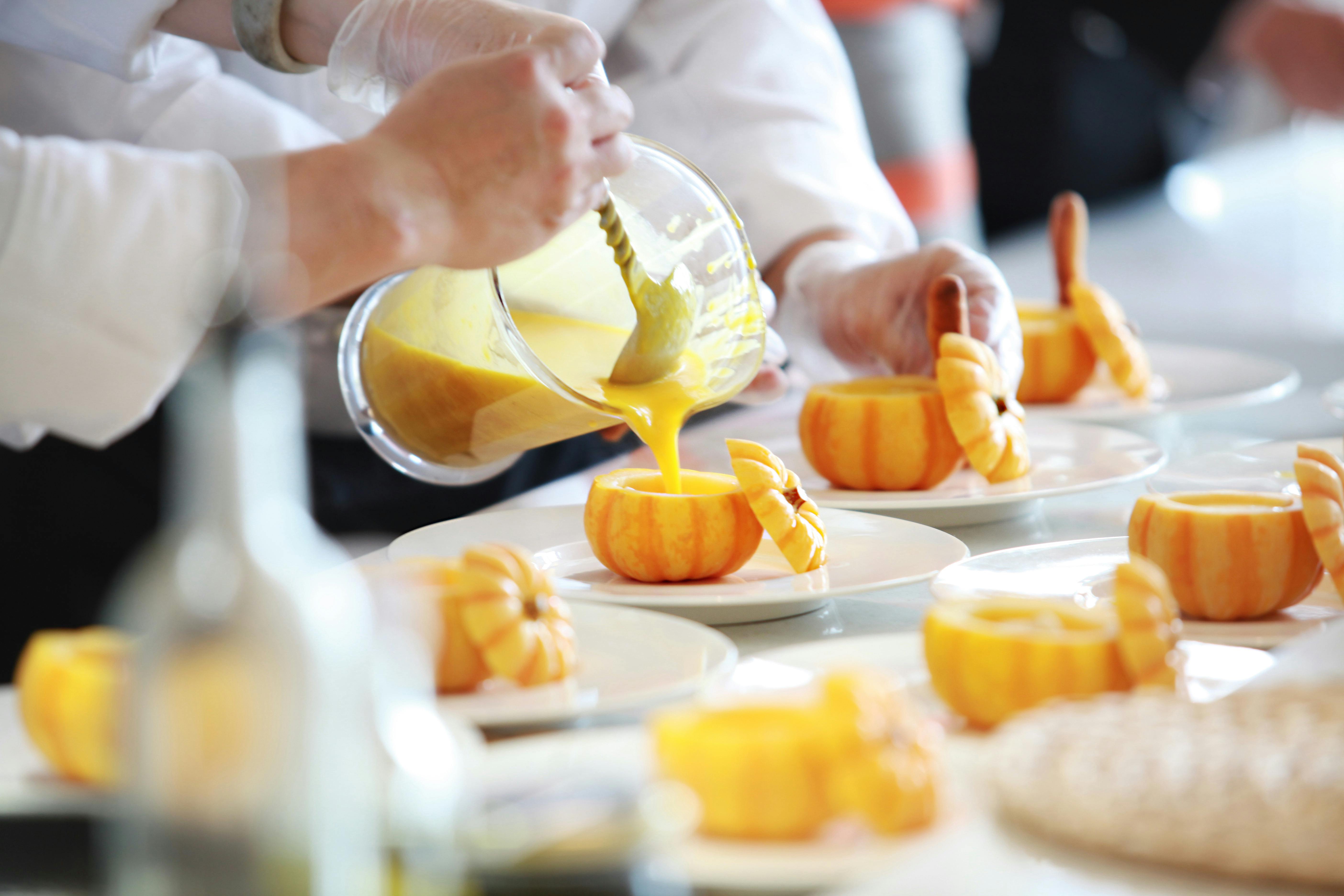
Seeing what color results from mixing 1/4 yellow and 3/4 red versus 1/2 yellow and 1/2 red, it all makes more sense.
What’s interesting is that when I took the class, the teacher provided me with the dye to make the colors you see in the fabric swatches below. I realized that the red was a magenta color, rather than what I normally see as red. (The teacher called it fuscia.)
And the blue was more of a turquoise than a traditional blue. But, since it was all new to me anyway, I didn’t really question the differences.
It was just today, while reflecting once again on the color, that I came across an explanation for the difference. Not that this is a complete explanation, but it does offer an idea.
It turns out that this guy named Dr. Herbert Ives ran AT&T’s television research during the 1920s and 1930s. Herbert’s interest in color began at a young age, as his father invented the techniques for color photography and the process halftone. Those techniques made it possible to print images in newspapers and magazines.
And Herbert created a color wheel made up of three “pure” colors. The real meaning of all this is that fabric dyes use the Ives color wheel, as became apparent when I took the fabric dye class.
The three pure colors are: magenta, turquoise and yellow. The vibrancy of these colors individually is remarkable, and when mixed together in specific formulas, they create the most powerful and beautiful colors in existence.
Quilts made primarily with these pure colors immediately attract attention, whether displayed in a quilt show or in your home.
When choosing colors for a quilt, you may want to keep in mind that intense colors can affect the mood of people looking at them. If you are making a quilt for a child who is already highly active, you may not want to do it using pure colors because it would further stimulate the child.
However, if you have a dull, dull room, like the full brown I had in my living room many years ago, adding pure colors will brighten up the room. In my case, it probably would have taken a truckload of pure colors to overpower brown.
These pure colors and their variations are found in nature, and it is interesting to note that whether the colors are tints or tints depends on the season. I know, that probably doesn’t make much sense.
But, it works this way. A tint includes all colors between white and the actual pure color. Pastels are good examples of tints, and pastels are the colors of spring: robin’s egg blue, peach, apricot, mint green, etc.
When you add black to a pure color, you get a shade of the color. As you can imagine, the shadows are the colors of autumn. When you add black to red, you get a rust color – shades of autumn leaves getting ready to fall from the trees.
A hue is what you get when you add gray (not black) to a pure color. These are the colors of winter and are generally calming colors. These colors are great for toddler bedrooms and quilts.
The real question on my mind is “who created the more ‘traditional’ color wheel? And why?”